ZIG ZAG
rebrand.
Zig Zag has spent decades supporting young women, trans, non-binary and gender diverse people through some of life's most difficult experiences. But while their services were well understood, their brand no longer reflected the strength, humanity and advocacy that sat at the heart of the organisation.
Working closely with the Zig Zag team and the young people they support, we developed a new brand strategy and visual identity that captured who Zig Zag truly is — a bold, compassionate organisation that stands alongside young people while challenging the systems that continue to fail them.
-
Zig Zag needed more than a visual refresh. They needed a brand that clearly expressed their purpose, values and personality while creating a stronger connection with the community they serve.
The challenge was to uncover the organisation's authentic voice and translate it into a cohesive identity that felt welcoming, empowering and unmistakably human. Every decision needed to be grounded in the lived experiences of both staff and service users, creating a brand that could build trust, increase awareness and support the organisation's long-term vision for systemic change.
-
The rebrand began with listening. Through a series of collaborative workshops with both the Zig Zag team and young people who had engaged with the service, we uncovered the beliefs, values and behaviours that define the organisation beyond the services it provides.
From these conversations emerged the idea of the Revolutionary Caregiver — an archetype that perfectly captured Zig Zag's unique balance of compassion and advocacy. It became the strategic foundation for the entire brand, informing everything from the tone of voice and messaging to the visual identity.
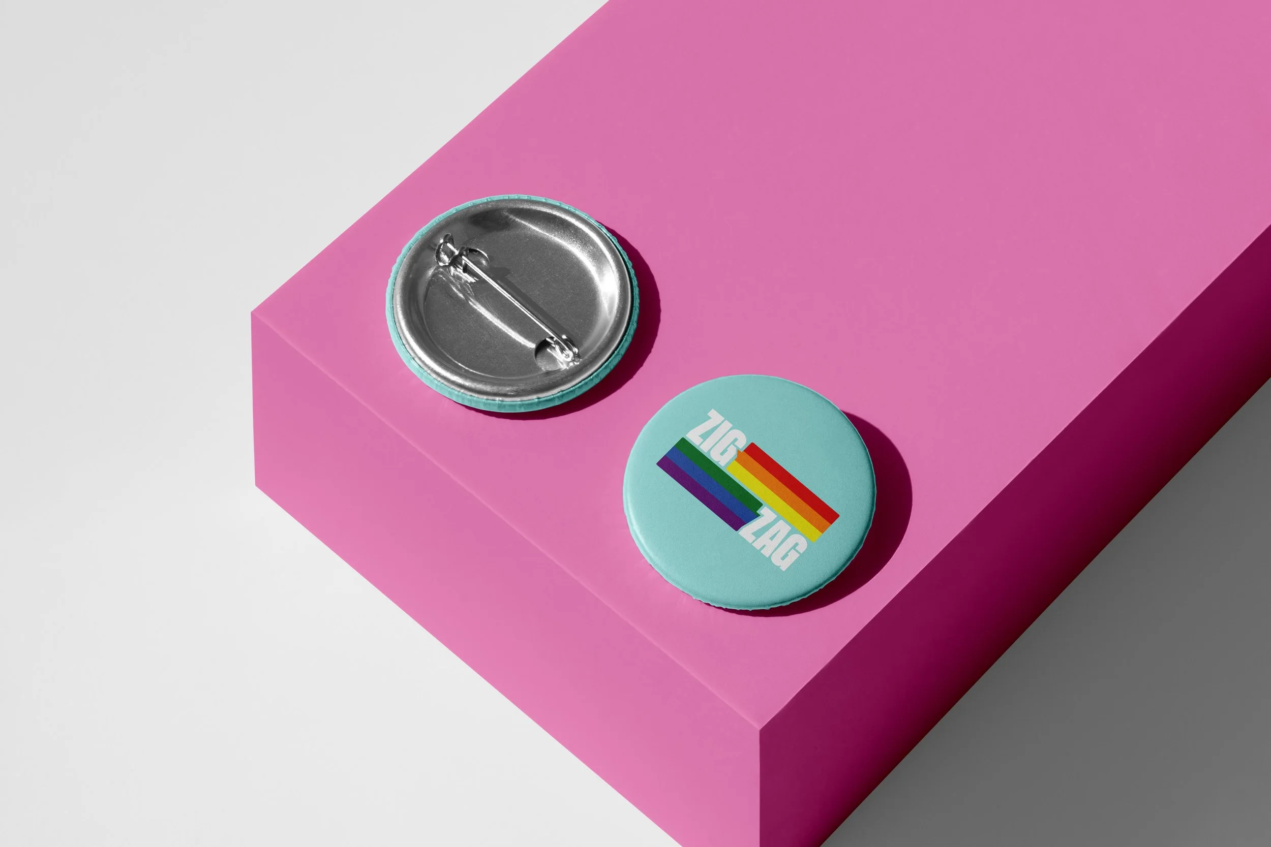
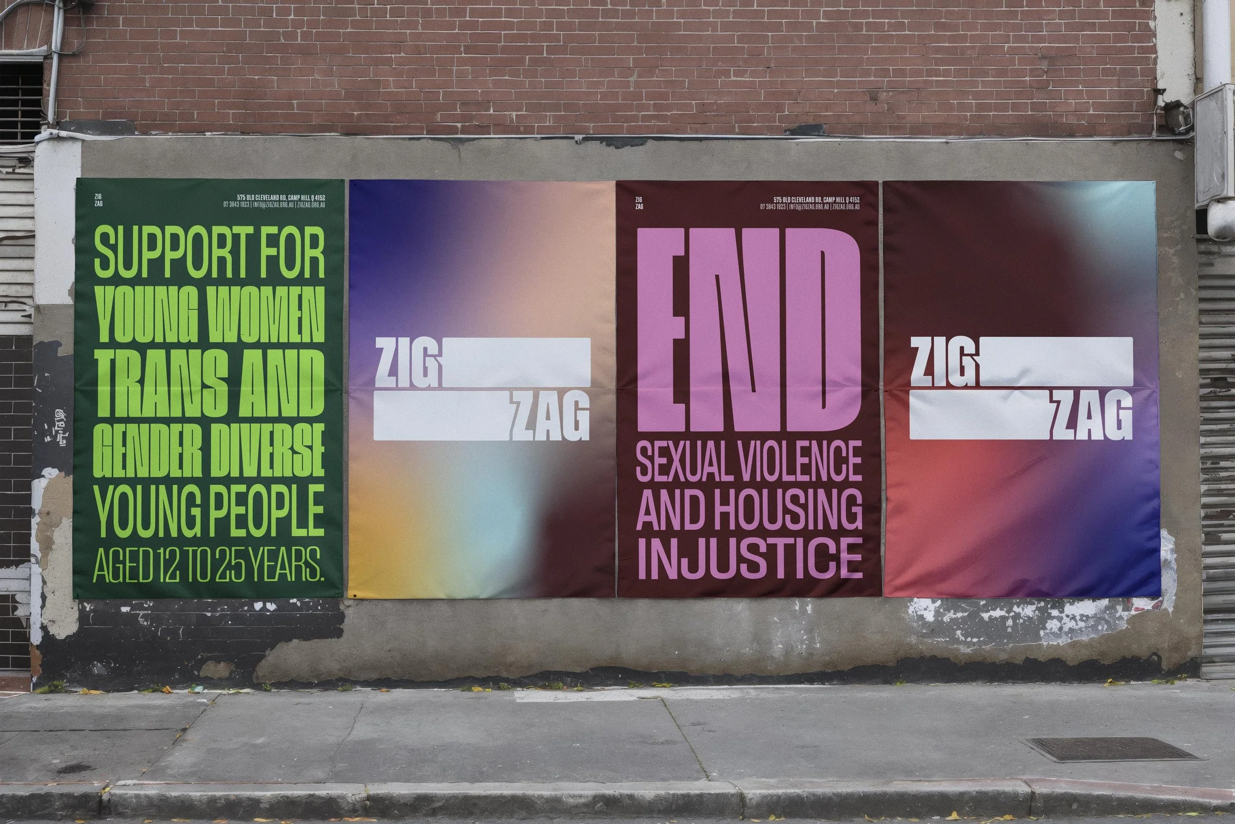
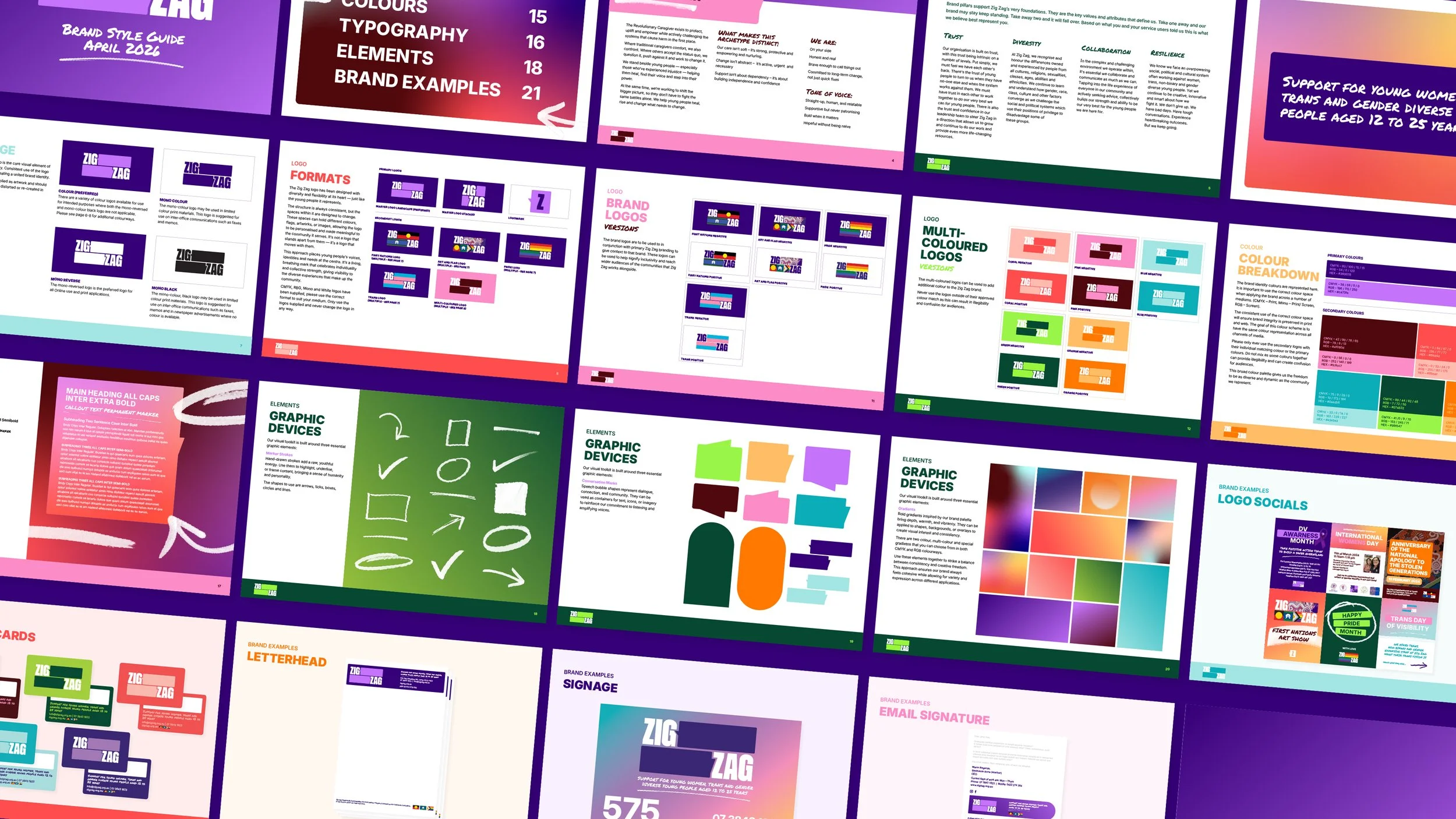
The identity system was designed to reflect the diversity of the community it represents. A flexible logo allows colour, imagery and community voices to become part of the brand itself, while a vibrant colour palette, hand-drawn marker strokes, conversation-inspired graphic devices and accessible typography create a visual language that feels confident, approachable and full of energy. Rather than presenting as a polished corporate organisation, the brand embraces honesty, individuality and real human connection, ensuring young people see themselves reflected in every interaction.
-
The result is a brand that feels as authentic as the people behind it. More than a new logo or colour palette, Zig Zag now has a clear strategic foundation that guides how the organisation communicates, behaves and shows up across every touchpoint.
The identity provides flexibility to celebrate the diversity of the community while maintaining consistency and recognition. Most importantly, it gives Zig Zag a stronger voice to advocate for young people, build trust with those seeking support and communicate the compassion, courage and determination that have always been at the heart of the organisation.